Wellington Management
Finance Website Redesign

Wellington Management Company is a private, independent investment management firm that acts as an advisor to clients around the world. Its mission is to exceed the investment objectives and service expectations of its clients worldwide.
The Team
Strategists
Copy writers
UX designers
UI designers
Developers
Timeline
2023
The Challenge
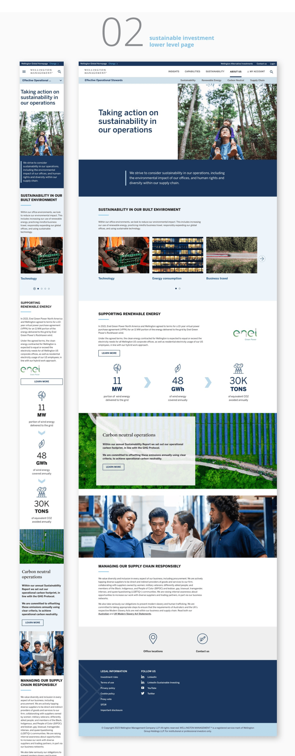
Welington’s site was faced with the challenge of low engagement, low lead generation and weak brand image which hinders them from presenting their true values to attract potential clients. The needed to revamp the site experience to increase engagement and gain inquires from new clients.
My Role
I focused on conducting site audit, competitor research, crafting information architecture, user journey map, wire-framing, and prototyping, adhering to Wellington's design system to reinforce a cohesive experience.
Ongoing client feedback was incorporated throughout the process to guide iterative improvements, leading to a successful launch.

Research
Wellington's digital platforms serve as a primary touchpoint for their target audience:
Institutional Investors, Intermediaries and startup founders.

As a general consumer, I wasn't familiar with the target audience of Wellington, so it was very important for me to try to understand their roles, responsibilities and their needs when they come onto the site of Wellington.

The investigation provided me the insight that:
Users not only consider Wellington as a potential partner, but they also use the site as a resource
The current site navigation is confusing and prevents users from getting the information they need


When they come onto the site, there’s a few things in particular that they’re looking for:


How might we help Wellington's target customers to find what they need?
How might we help Wellington showcase their forward-thinking and deep expertise, differentiate from competitors, and create specialized destinations for key targets?

Site Audit
Analyzing current designs and site performance.

Competitive Analysis

Analyzing site structures
and global experience
Information
Architecture

Findings
It doesn’t account for regional differences
Confusing structure that annoys users in their journey path
In-efficient for busy customers to navigate and find information
Complexity
01
There is Redundant content in Wellington SI pages without apprehensive content.
Their content organization fails to tell an apprehensive and compelling story that presents their edges and capabilities as one of the largest private asset management firms.
Bad content organization
02
The experience lacks interactivity with engaging interactive components and compelling UIs. This hinders desires and curiosity from users to keep scrolling and learning about Wellington.
Confusing navigation & lack of interactivity
02
UX Visions
For target customers get a sense of available information and where they are at a glance, help them quickly locate information and make decisions.
Improve site
structure
- Re-construct menu
- Add a secondary nav
- Incorporated regional differences
01
Improve content organization
- Add new content
- Include relevant content that helps SEO
- Add useful in-page and out-page links
02
Improve Overall UI
- Add compelling and interactive UI
- Fix Type hierarchy
- Add new sustainable modular designs
03
Design Explorations
We initially came up with these solutions but due to limited budget and constraints,
we had to cut down on new modules.
We identified net new modules and existing modules and had to cut down on a lot of the net new modules based on design feasibility, user values and client budgets.